I agree R.I.P. but I do both so the detail can be seen. What's unfortunate is that neither on nor off really gives "perfect" colour. The actual colour is somewhere in between the darker "off" and the brighter "on". I have to learn to use my camera better. I suspect that I can set it somehow to make a more accurate colour representation. I just have to get 'round to it. Part of the problem is also lighting. I'm taking these pictures in an area where there is not much artificial light, so depending on the time of day, the picture quality varies. I'll get it right eventually.
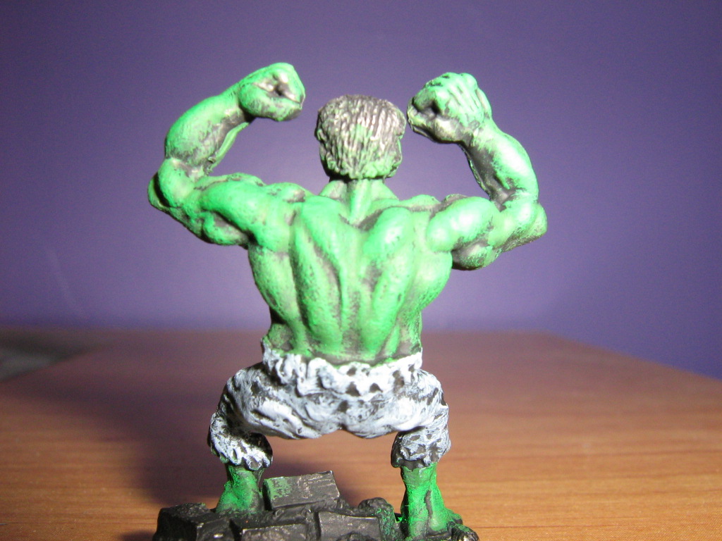
Unfortunately, all the store lighting, including my work light is flourescent. I'm going to have to bring some "real" lighting for the "official" portraits when I'm finished each figure. It'd probably be helpful if I actually learned to use my camera's white balancing feature too...


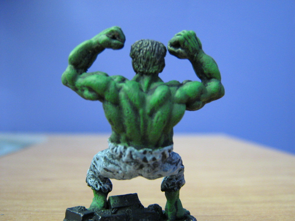
Cooool!flash off looks better.
ReplyDeleteI agree R.I.P. but I do both so the detail can be seen. What's unfortunate is that neither on nor off really gives "perfect" colour. The actual colour is somewhere in between the darker "off" and the brighter "on". I have to learn to use my camera better. I suspect that I can set it somehow to make a more accurate colour representation. I just have to get 'round to it.
ReplyDeletePart of the problem is also lighting. I'm taking these pictures in an area where there is not much artificial light, so depending on the time of day, the picture quality varies.
I'll get it right eventually.
if it's under florecent light that sometimes gives an off color.
ReplyDeleteUnfortunately, all the store lighting, including my work light is flourescent. I'm going to have to bring some "real" lighting for the "official" portraits when I'm finished each figure. It'd probably be helpful if I actually learned to use my camera's white balancing feature too...
ReplyDelete